Continuing my fascination with cruise ships, I decided to try and build heatmaps from the cruise ship location data I gathered in a previous post.
After looking into a few heatmap options, I settled on using heatmap.py because of its rich feature set and simple interface. I avoided using the Open Street Maps integration due to its licensing issues and instead used an equirectangular world map from Wikipedia.
Generating Maps
I originally tried generating heatmaps on my Macbook, which worked great for inputs under
around 50,000 rows. Beyond that, heatmap.py begins consuming so much memory it is
impossible to use. There are options you can use with heatmap.py (--range and --decay=0)
that reduce its memory footprint, but I didn’t like the resulting images when using a
decay of 0 so I had to upgrade my hardware.
Enter Google Cloud Platform’s Compute Engine. I spun up a 4 vCPU instance with 20GB of memory, which tore through a 2.1 million point map in about 30 minutes. The instance costs about $0.15 an hour, so this is pretty cost-effective for static images.
Static Maps
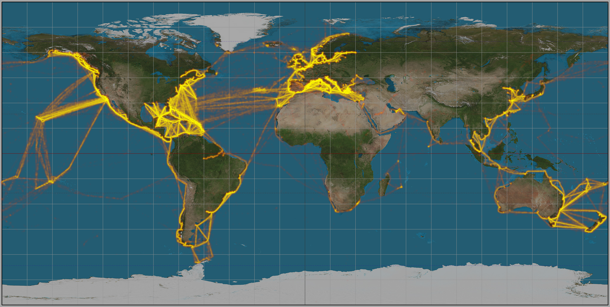
The first map I built was of all major cruise liners for all time. It contains the above-mentioned 2.1 million distinct coordinates.
python heatmap.py \
--ignore_csv_header \
-I base.jpg \
-P equirectangular \
-W 2058 -H 1036 \
-B 0.66 -e="-89,-180,89,180" \
-o out.png coords_map_major_cruise_lines.csv
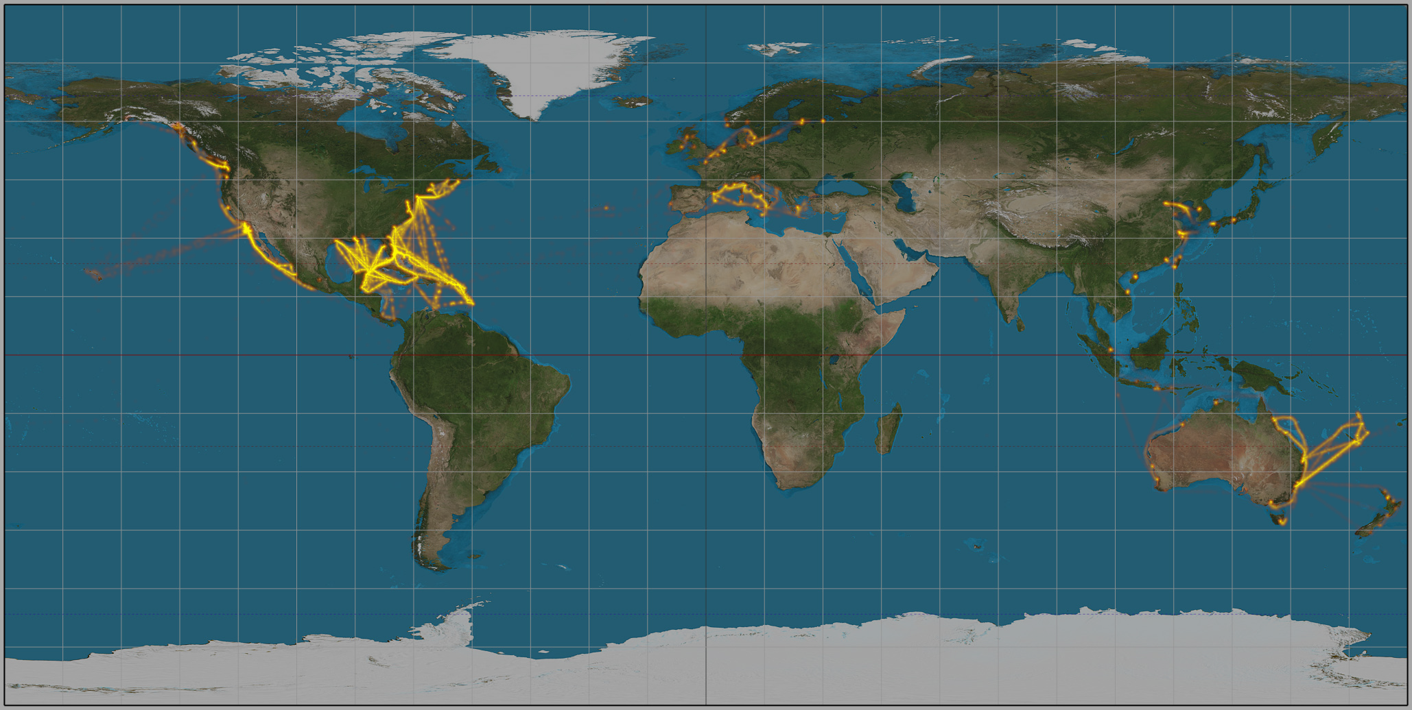
Next, I wanted to compare the routes different cruise lines use. I built datasets with three cruise lines’ ships in them and mapped them:
Royal Caribbean International

Carnival Cruises
Disney Cruises
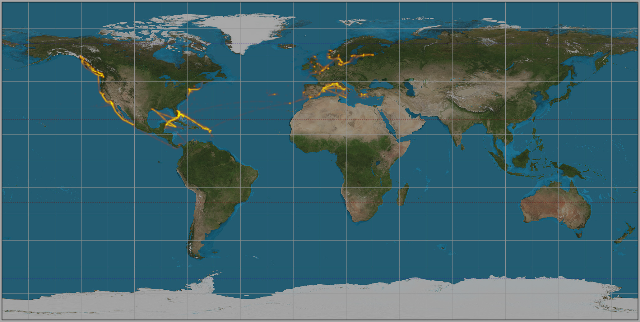
As expected, all three cruise lines hit the same major routes: the Caribbean, Mexico, and Alaska. Carnival seems to focus heavily on the Caribbean while Royal Caribbean has more diverse itineraries in the Mediterranean, Asia and South America. Disney only operates four ships, so their routes are understandably limited.
Animated Maps
heatmap.py has an animate option that I found very intriguing. To test it out, I built
a dataset of one ship’s coordinates in ascending time order to show where the ship travels
over time. Since I can’t start small, I used the Norwegian Pearl for this experiment, the
ship with the most coordinates in the dataset.
The animate option does pretty much what you’d expect: it generates incremental PNG frames
for each point in the input dataset and combines them all using ffmpeg. Since the
Pearl’s coordinate dataset contains 42,000 points, it generated 42,000 heatmaps. The
process of building the below animated heatmap took
over 72 hours on the Compute Engine
instance I was using.
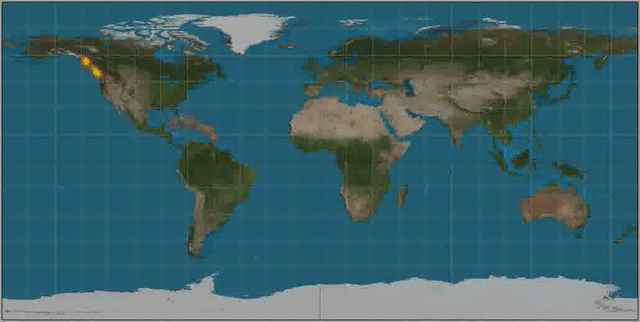
It’s interesting to see the ship bounce back and forth between Alaska and the Caribbean via the Panama Canal. It makes sense that ships running the Alaskan route don’t stay in the North East Pacific during the offseason, and instead head to warmer waters where cruises run year-round.